Interactive Analysis of Sentence Embeddings
Embedding Projector is a free web application for visualizing high-dimensional data. It has built-in demos for visualizing word embeddings in NLP and image embeddings for MNIST in Computer Vision.
I recently experimented with a way to load sentence embeddings along with the class labels into this tool and explore them interactively. In this blog post, I will explain the end-to-end process with an example dataset.
Toy Example: Outlier Detection
1. Preparing Dataset
To understand this use case, let’s take a subset of 100 movie reviews from the SST-2 dataset which are labeled as positive and negative.
import pandas as pd

df = pd.read_csv('http://bit.ly/dataset-sst2',
                 nrows=100, sep='\t', names=['text', 'label'])

df['label'] = df['label'].replace({0: 'negative', 1: 'positive'})
The dataset has a column containing the text and a label indicating whether it’s positive or negative opinion.
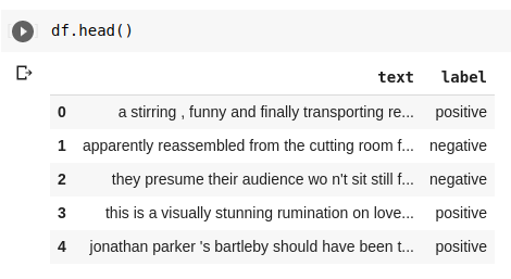
We will introduce noise into our dataset by corrupting five of the responses with random text. It will act as an outlier for our example.
df.loc[[10, 27, 54, 72, 91], 'text'] = 'askgkn askngk kagkasng'2. Generating Embeddings
Now, we will compute sentence embeddings for the headlines using the sentence-transformers package. First, let’s install it using pip.
shell
!pip install sentence-transformersNext, we will create a helper function to return a NumPy array of sentence embeddings given a list of sentences.
from sentence_transformers import SentenceTransformer

sentence_bert_model = SentenceTransformer('distilbert-base-nli-stsb-mean-tokens')

def get_embeddings(sentences):
    return sentence_bert_model.encode(sentences,
                                    batch_size=32,
                                    show_progress_bar=True)
Using the above function, we can generate sentence embeddings for our data as shown below.
e = get_embeddings(df['text'])
# shape: (100, 768)
3. Exporting to Embedding Projector Format
Embedding Projector requires two TSV files to load our custom embeddings. - output.tsv: This file should contain the embeddings without any headers. - metadata.tsv: This file should contain the original text and labels for the embeddings
Let’s first generate the output.tsv file for our sentence embeddings from the previous step.
# Convert NumPy array of embedding into data frame
embedding_df = pd.DataFrame(e)

# Save dataframe as as TSV file without any index and header
embedding_df.to_csv('output.tsv', sep='\t', index=None, header=None)
To generate metadata.csv, we simply save our original dataframe.
# Save dataframe without any index
df.to_csv('metadata.tsv', index=False, sep='\t')
4. Importing into Embedding Projector
We first go to https://projector.tensorflow.org/.
On the left-hand sidebar, click the Load button.
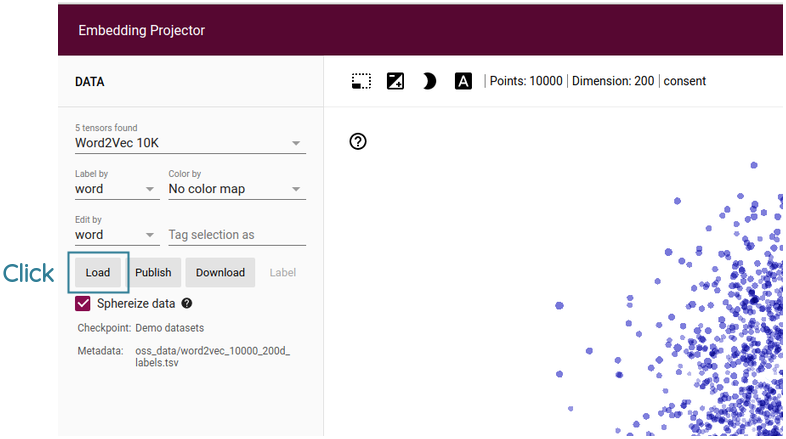
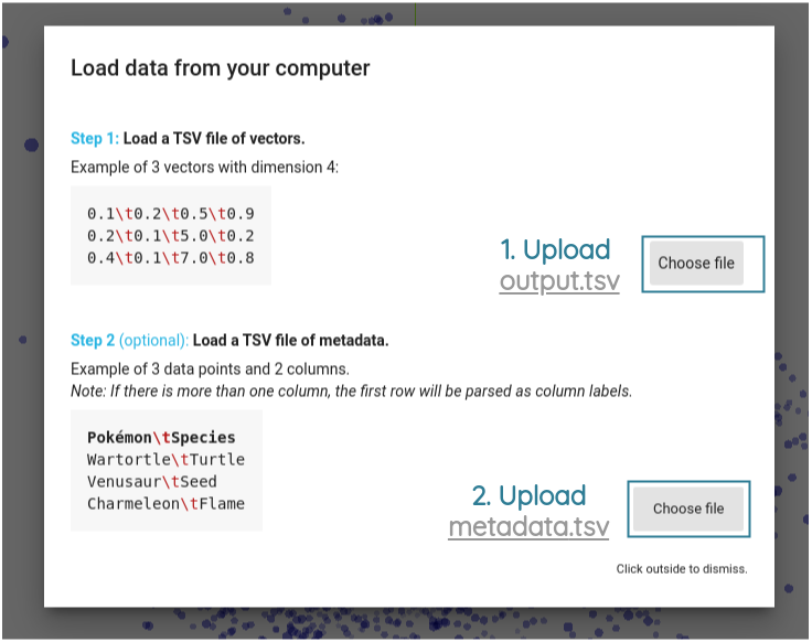
Then, for the first Choose file button, upload the output.tsv file and for the second Choose file button, upload the metadata.tsv file.
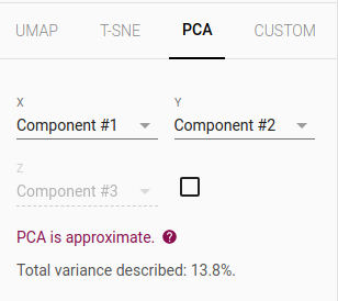
After uploading both files, click outside and you should see the sentence embedding projection. The dimensions of embeddings are reduced to 3D by default using PCA.
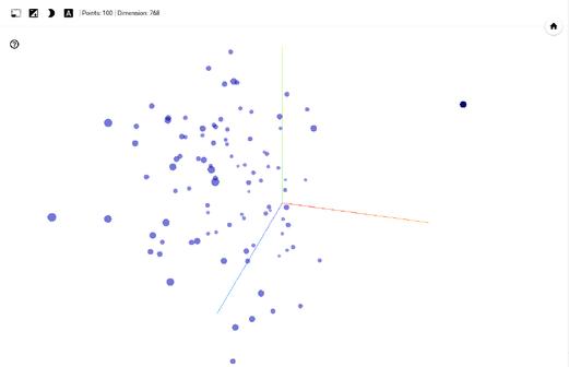
Let’s switch to 2D by turning off the checkbox for ‘Component #3’ in the bottom part of sidebar.
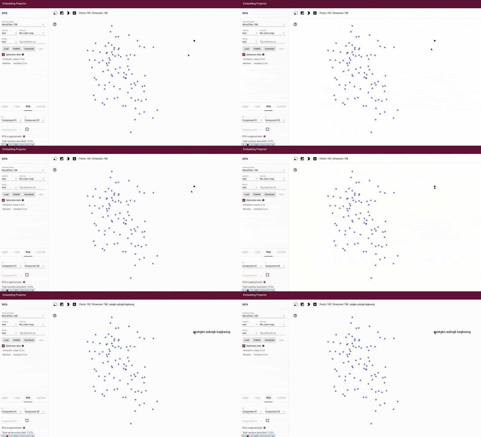
On the 2D visualization, we can see how the random text is far from other groups of text as an outlier. On hovering the point, we see the text askgkn askngk kagkasng.
5. Useful Features in Projector
a. Class Separation
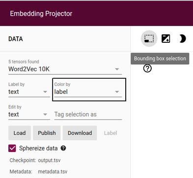
We can enable color coding of the points by their actual labels (positive vs negative) by using the Color by dropdown in the left sidebar.
Select the name of the column that contains your labels. In our example file, the column name is label.
The points themselves are interactive. You can see the actual sentence for each point by hovering over them.
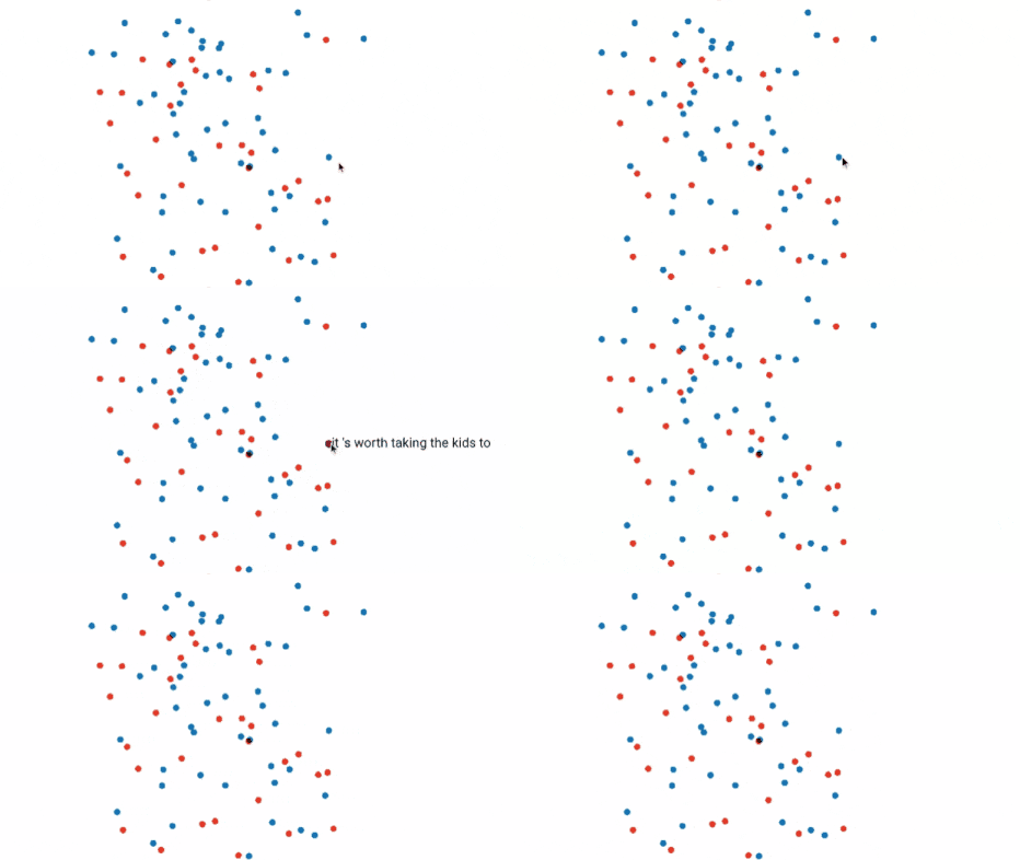
You can click on the point to show the metadata. We can see below on clicking a blue point that its label is “positive” in the popup.
So the blue points are positive and the red points are negative. When a point is selected, 100 nearest points in terms of cosine similarity are also highlighted.
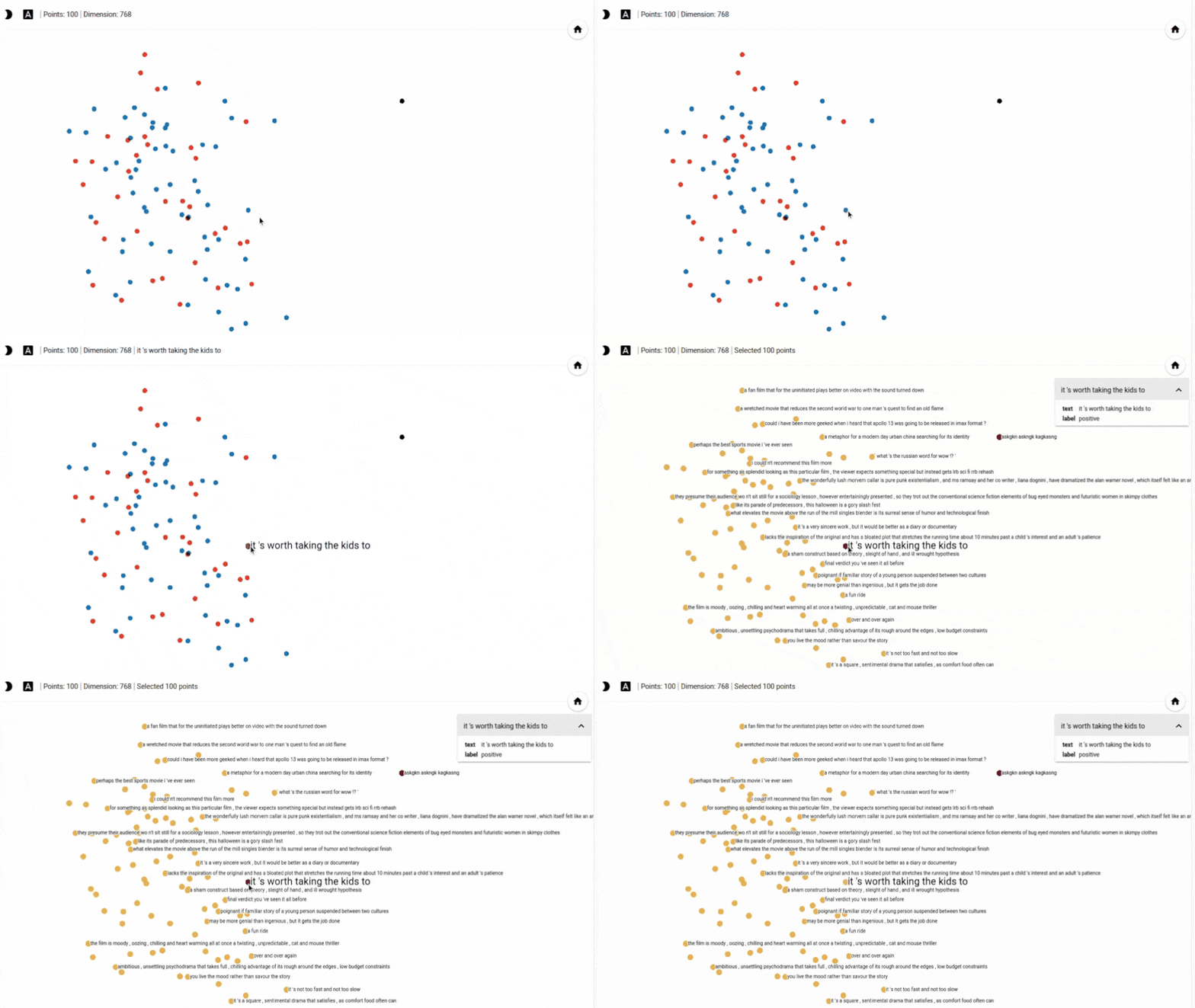
To get back to the original view, we can click on any empty white space.
The color coding can be a useful heuristic for many use cases:
- It can be used to explore class overlap for the dataset you’re working on and identify tricky sentences.
- If there are labeling errors in your dataset, then this might help uncover them. For example, if a whole cluster of points is in a certain color, but some single point in that cluster is in a different color, then that might be an outlier or labeling error.
b. Dimensionality Reduction Algorithm
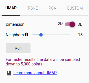
The web app provides three standard dimensionality reduction techniques: UMAP, T-SNE, and PCA.
You can choose the algorithm and their parameters from the bottom of the left sidebar.
c. Custom Linear Projection
You can also use a custom keyword or full text as the axis using the CUSTOM tab. This will apply a custom linear projection and can help us explore meaningful directions in the embedding space.
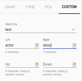
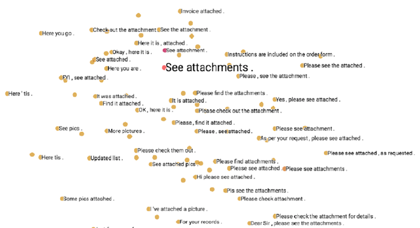
For example, the Gmail team tried setting “yeah” on the left side and “yes” on the right side. When they projected encoder embeddings for email replies to this custom linear projection, they found replies in a casual tone (e.g. Here you go) on the left side and responses in a more formal tone clustered towards the right side.
Conclusion
Thus, Embedding Projector is a very useful tool to better understand the datasets and models we work with.
References
- Daniel Smilkov et al., Embedding Projector: Interactive Visualization and Interpretation of Embeddings